
Table of Contents
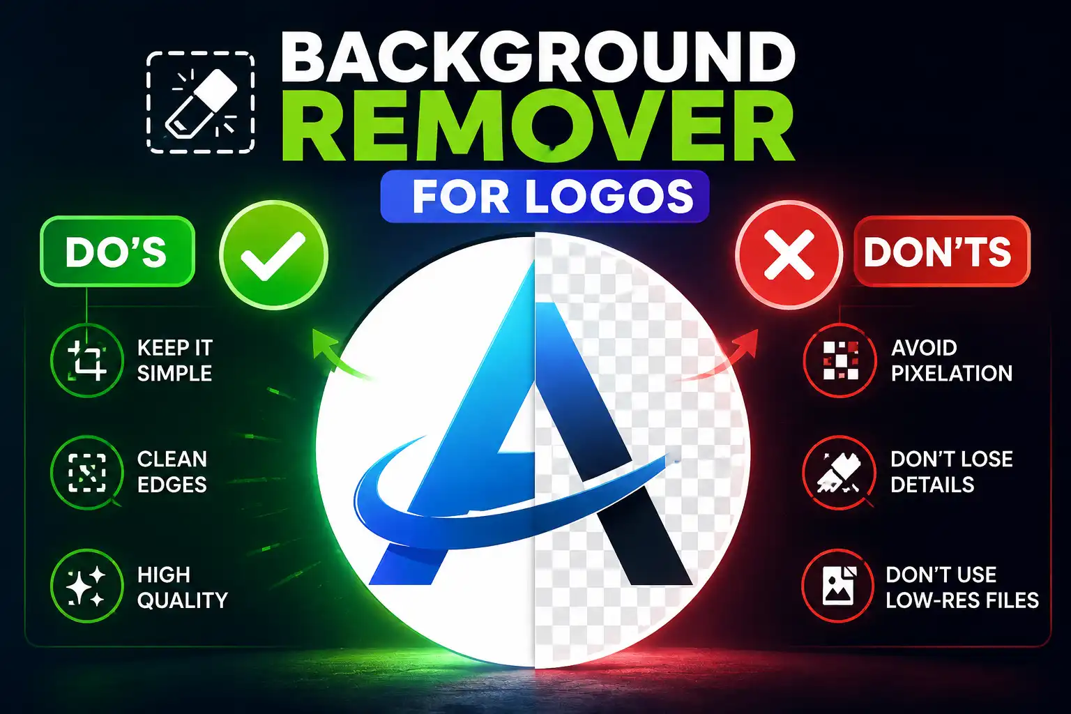
A logo sitting on a white rectangle looks unfinished. Whether you're dropping it onto a website header, a presentation slide, or a product mockup, that box has to go. A background remover for logos solves the problem quickly — but the difference between a professional result and an obvious cutout comes down to a handful of decisions you make before and after processing.
This guide covers what actually matters: the quality of your source file, why contrast determines success, which format to save afterward, and where automated removal works well versus where it needs more attention. You'll also see how the right online tool fits into a realistic workflow without wasting time.
Why Logo Background Removal Is Different From Photo Background Removal
A photograph usually has soft edges, gradual focus shifts, and complex color transitions. A logo doesn't. Logos are built from flat colors, hard geometric boundaries, and text. That structural difference changes how removal works.
When software removes a background from a portrait, it's making judgment calls about hair strands and soft shadows. When it removes a background from a logo, it's looking for strong contrast between defined shapes and the surrounding area. In theory, that should make logos easier. In practice, small details like thin strokes, tight letter spacing, and enclosed negative space create their own problems.
Automated background removers are designed to detect the dominant foreground subject. With a logo, the tool should ideally treat the entire mark — including internal gaps like the hole in a letter "O" — as one continuous object. The best results happen when the tool correctly identifies those enclosed regions as part of the logo rather than background.
That's why a background remover for logos needs more than a generic edge detector. It has to understand connected shapes and preserve interior transparency separately from exterior removal. When it works, you get a crisp PNG with a transparent background that functions everywhere. When it doesn't, you get holes in solid areas or leftover background between letters.
Do: Use a Clean, High-Contrast Source Image
The single most important factor in background removal quality isn't the tool. It's the image you feed into it.
A good source for logo background removal has:
- A strong color difference between the logo and the background
- Sharp, well-defined edges with no blur or compression artifacts
- Reasonable resolution — at least 500 pixels on the longest side for most uses
- Minimal noise, shadows, or gradient effects that bleed into the logo
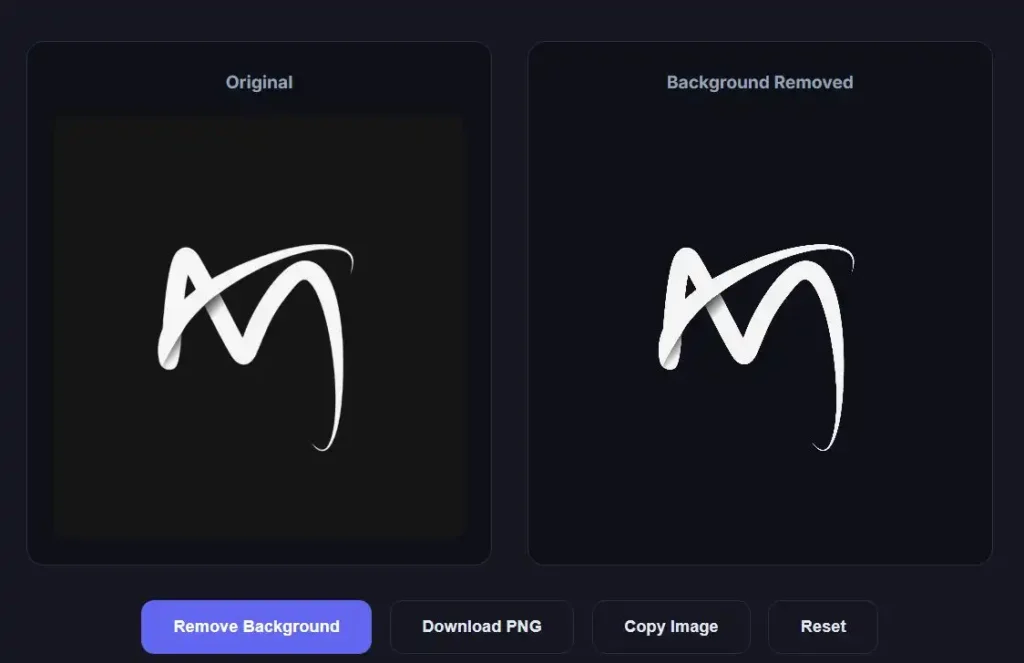
A dark navy logo on a white background is nearly ideal. A white logo on a light gray background is much harder because the edge contrast is too low. The tool can't tell where the logo stops and the background begins.
If your source file is low contrast, you can improve it before removal. Increasing brightness and contrast in any basic image editor pushes the background further from the logo's color range. That gives the automated tool a clearer decision boundary. It's a two-minute step that prevents a frustrating, muddy result.
For most day-to-day cases, you can run the image through the MiniToolsPro background remover directly. But if the preview shows rough edges, step back and improve the source contrast first.
Don't: Upload a Tiny or Heavily Compressed Logo
Background removal deletes pixels permanently. The fewer pixels you start with, the worse the final output looks.
A 100-pixel-wide logo taken from a website favicon has almost no detail to preserve. Curves become jagged, text becomes unreadable, and the transparent version looks noticeably degraded. Compounding the issue, if that small file was saved as a low-quality JPEG, the logo's edges are already contaminated with compression noise. An automated tool may interpret that noise as part of the background or shave it off unevenly.
Before you process any logo, check its actual pixel dimensions. If it's smaller than you'd comfortably display on a website or slide, find a better source. Check your brand asset folder, your email attachments, your cloud storage, or ask whoever provided the logo for a higher-resolution version.
If you genuinely can't find a larger file, you can still remove the background, but temper your expectations. The transparent result will work as a small icon or favicon, but it won't hold up at full banner size.
Do: Understand Transparent PNG as Your Default Output
After a background remover finishes, the output is typically a PNG with transparent regions. That transparency is what makes the logo usable on any background — dark websites, colored flyers, photo overlays, or product shots.
PNG supports full alpha transparency. That means each pixel can be partially transparent, which allows for smooth anti-aliased edges. It's the reason a properly processed logo doesn't look like it was cut out with scissors.
But here's the common mistake: saving or converting that transparent PNG into a JPEG later. JPEG doesn't support transparency. If you upload a transparent PNG to a platform that converts it, or if you resave it as a JPEG yourself, the transparent areas get filled with a solid color — usually white or black. The logo now has a box again, and you've undone the work.
Keep the transparent PNG as your master file. Create JPEG or other flattened versions only for specific cases where you intentionally want a solid background.
Don't: Assume One Pass Is Always Enough
Automated tools are fast, but they're not omniscient. On a clean, high-contrast logo, one pass often produces a usable result. On anything with thin lines, tight text, or complex iconography, you may need to review and refine.
After processing, zoom in to at least 200% and inspect:
- Are the edges smooth or jagged?
- Is there any white or gray fringe around the logo?
- Did thin strokes disappear or get partially erased?
- Are there holes inside solid areas?
- Is there background residue trapped between letters?
A logo with the word "Modern" in a light sans-serif font is a classic failure case. The thin stems of letters like "r" and "n" can get shaved down. The space inside the "e" might retain background color. At thumbnail size these flaws are invisible. At actual usage size, they're glaring.
If the result is close but not perfect, a second pass can help. Some tools let you manually mark areas to keep or remove. Or you can process a version with higher contrast. The point is to check, not to blindly download and deploy.
Where Automated Tools Excel — and Where They Struggle
Not every logo needs the same level of care. A simple, flat, solid-color mark on a plain background is a perfect candidate for automated removal. The tool identifies the shape, knocks out the background, and delivers a clean transparent PNG in seconds.
The tool works well when the logo:
- Uses one or two solid colors
- Has a simple, recognizable silhouette
- Sits on a plain white, black, or strongly contrasting background
- Doesn't include gradient glows, soft shadows, or semi-transparent effects
- Has reasonably thick lines and readable text
It struggles when the logo includes:
- Gradients that fade into the background color
- Outer glows or soft drop shadows
- Hairline strokes or ultra-thin fonts
- Multiple nested shapes with tiny gaps between them
- Backgrounds with busy patterns or similar colors
For these cases, no automated background remover for logos will produce a flawless result in one click. The solution is either manual editing in a full design tool, or adjusting the source to reduce the effect causing the problem — for example, re-exporting the logo without a shadow.
The Workflow That Produces a Usable Logo
When you need a background-free logo, follow a sequence that prioritizes source quality and verification:
1. Find the best source. Check for the original high-resolution file. Avoid screenshots if possible. If you must use a screenshot, crop tightly around the logo to maximize the effective resolution.
2. Assess contrast. Does the logo clearly stand out from its background? If not, adjust brightness and contrast in a basic editor before uploading.
3. Process the image. Use an online background remover for logos to convert the flat image into a transparent PNG. This is the step where the heavy lifting happens automatically.
4. Inspect at high zoom. Check edges, interior spaces, and thin details at 200–400% magnification. Look for any of the common failure patterns.
5. Test on different backgrounds. Place the transparent PNG on white, black, a mid-gray, and a bright color. If a faint fringe or missing detail appears, revisit the source or process again.
6. Save as PNG and keep the master. Don't convert to JPEG unless you have a specific reason. Keep the transparent version for future use.
This process takes a few minutes for most logos. The tool removes the tedious manual work; your job is to provide good input and verify the output.
Common Mistakes That Make Logos Look Amateurish
Beyond the obvious problems, a few subtle errors keep showing up in real-world logo use. Watch for these:
Leaving a faint white halo. The logo looks fine on a white slide but develops a ghostly outline when placed on a dark background. The cause is semi-transparent white pixels at the edges left over from the original background. Fix it by processing with higher contrast or cleaning the edge manually.
Accepting rough anti-aliasing. Curves that look jagged at full size usually mean the source was too small or too compressed. The tool can't invent detail that wasn't there. Get a better source file or accept the result as a small-use-only asset.
Using the wrong logo version. A brand often has a dark version for light backgrounds and a light version for dark backgrounds. Removing the background from a dark logo and then placing it on a dark website header is a visibility failure, not a background removal failure.
Overprocessing a simple logo. If the logo is already a vector file or a high-quality PNG with transparency, you don't need a background remover. You need to re-export it correctly. Check what you actually have before assuming removal is necessary.
Related Tools That Fit the Same Workflow
Background removal is rarely the only edit a logo needs. Once the background is gone, you may also need to resize the file for a specific platform or compress it so it loads quickly on a website.
If the transparent PNG is too large, reducing its file size with an image compressor can help — especially when you're uploading to a platform with file-size limits. If you need the logo at specific pixel dimensions for a header or social profile, an image resizer handles the scaling without a full design tool.
These tools work together. Remove the background first, verify the result, then resize or compress the transparent PNG for the intended use. Each step preserves the quality you already secured.
Why AI Background Removal Can Struggle With Logos
Logos often contain sharp edges, small text, and detailed shapes that need to remain intact. Understanding how AI background removal works can help you understand why some logos need a little more checking after automatic background removal.
Frequently Asked Questions
Can a background remover handle a logo with text?
Yes, but text adds risk. Small letters, thin strokes, and tight spacing create edges that automated tools may misread. Inspect the result closely at high zoom, especially around the inside spaces of letters and thin strokes. A second pass or manual touch-up may be needed for text-heavy logos.
What's the best format for a logo with no background?
PNG is the safest default because it supports full transparency and is widely compatible. WebP offers smaller file sizes with transparency and works well for modern web use. SVG is ideal for vector logos. Avoid JPEG, which cannot store transparent pixels.
Why is there a white line around my logo after background removal?
That's edge fringe — semi-transparent white pixels left from the original background. It's most visible when the logo sits on a dark surface. Reducing it requires either higher contrast in the source image, a more careful removal pass, or manual edge cleanup.
Do I need design experience to remove a logo background?
No. For simple logos with clean edges and good contrast, an online background remover does the work automatically. You only need to check the result. Complex cases with gradients, shadows, or fine details may benefit from design experience, but most everyday logos don't require it.
Is it safe to upload a logo to an online background remover?
For most non-confidential brand assets, yes. If you're working with an unreleased logo or a proprietary design, consider the sensitivity of the file before uploading. For typical business and personal logos, browser-based tools are a practical option.
Make the Background Disappear Without Making the Logo Look Worse
A background remover is a rescue tool. It's what you use when a flattened image is all you have and a transparent version is what you need. The result depends more on your input quality and your willingness to check the output than on the tool itself.
Start with the cleanest source you can find, make sure the contrast is strong, process it once, and inspect the edges before using the logo anywhere. If something looks off, fix the source and try again. When you need the job done without opening a full design suite, use the MiniToolsPro background remover to turn a flat logo into a transparent PNG in seconds. Then test it, save it, and put it to work.
Before exporting your logo, think about where it will be used. A transparent PNG is often more flexible because it can be placed over different designs and colors. Our comparison of transparent PNG vs. white background explains the differences.
Share this article 👇


0 Comments